| | | | | | | | | | | | | | |
|
Rhapsody's Universal Colors Palette
There are a number of features of Rhapsody which can be used with third party applications, the Colors Palette is one which is often overlooked when people are exploring these features. It isn't hard to blame them, the palette looks deceptively simple to use, so most people pop into and out of it very fast. We're going to take a little longer look at it today.
By default (on my systems at least), when you open up the Colors Palette you are faced with the color wheel. This is a very quick and easy way to find the color you need (which is why it is so easy to miss the rest of the parts of the palette).
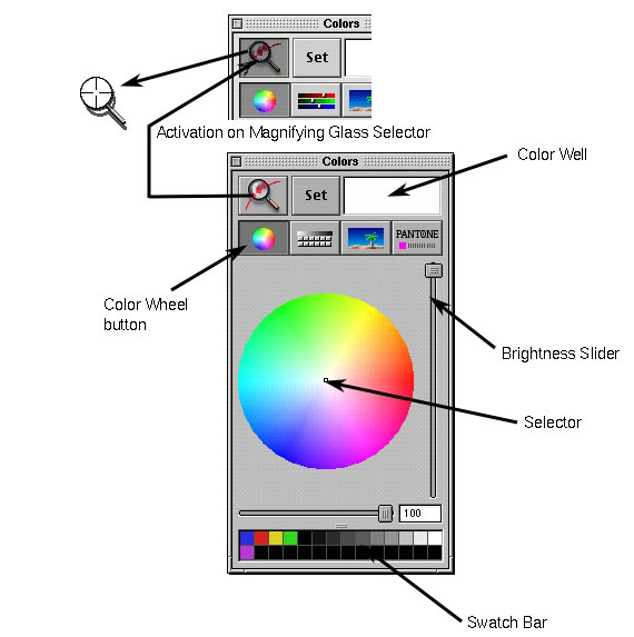
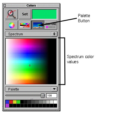
In this first image below, I label most of the major parts visible on the Colors Palette. The things which are displayed on the palette at all times are the set button, the Color Well, the Swatch Bar across the bottom (which is adjustable in it's size) and the Magnifying Glass Selector. The Magnifying Glass Selector turns your curser into a magnifying glass icon which you can use to pick any color displayed on any pixel on your screen at the moment, even items which are not part of the foreground application. |
|
|
|
|
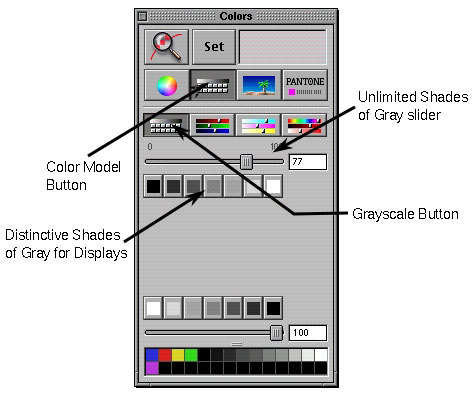
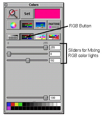
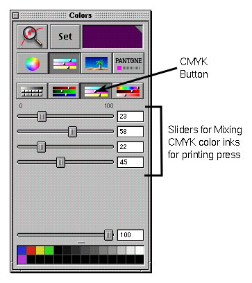
| Right next to the Color Wheel button is the Color Model Button. This brings up four category buttons which you can choose from. In the series of images we have the palette displaying the Grayscale, RGB, CMYK and HSB categories, with the features of each pointed out in the images. |
|
| |
|
|
| | |
|
|
| | |
|
|
| | | |

|
|
| Further down we have the Palette Button. By default (again on my systems), you are first presented with the Spectrum display selection area. Like with the Color Wheel, you can find your color and select it by clicking on the area you want. |
|
| | | | |
|
|
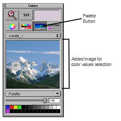
| Another thing you can do is drop an image into that field to fine specific colors which you want to use (below I have dropped an image of a mountain scene into the field). |
|
| | | | |
|
|
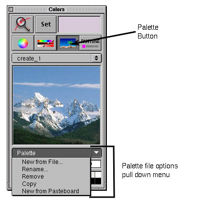
You can collect a number of these pictures, organize them or remove them using the pull down File menu at the bottom. This should let you create a catalog of images from which to draw your colors from.
|
|
| | |
|
|
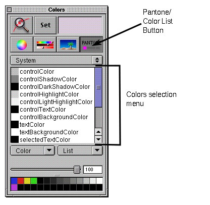
| The final button is for Pantone and list of colors. The system has a few lists by default, and you can create your own in this area. |
|
| | |
|
|
| This feature is originally from the NEXTSTEP/OPENSTEP family of operating systems and still exist today in Mac OS X. Obviously, this feature is wasted on a server/workstation type of system. It was designed and intended for a graphics workstation used by trained graphic designers. Having family and friends in this area, I know that there are courses in schools on color theory that address the detailed uses of all the parts of the Colors Palette. For most people, the big problem is even knowing that it is there. |
|
| | | | | |

|